Photography Tips
Keep White Walls Consistent Across Listings, No Reshoot Needed
Ensure your listing photos consistently showcase bright, true-to-color white walls to enhance property appeal without costly reshoots.
By Hospitality Lens · · 19 min read
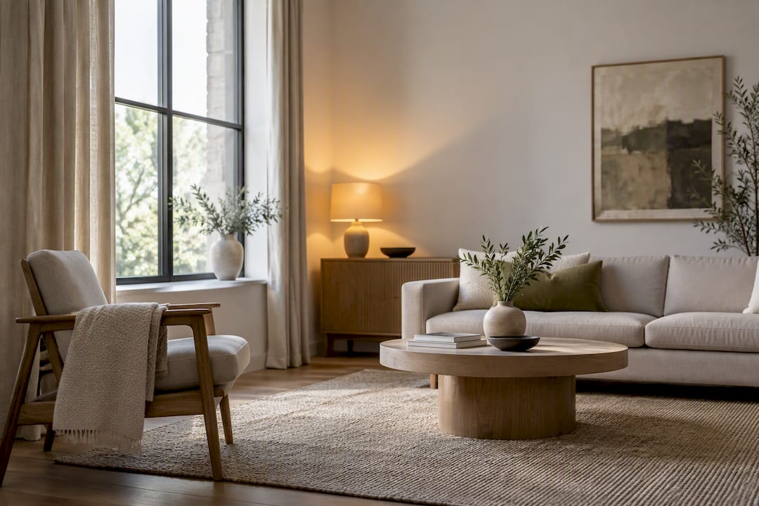
If your listing photos make white walls look gray, the cause is almost always white balance or exposure, and both are fixable. Reshoot only when the originals are unusable: badly clipped, noisy, or missing angles. Otherwise, correct the color in RAW or with careful JPEG edits. A free watermarked preview can show what enhancement can do before committing to either path.
TL;DR:
- Correcting white balance and exposure in RAW files is essential, as this allows full recovery of color and prevents walls from reading as gray.
- Addressing mixed lighting by turning off conflicting sources or matching color temperatures ensures uniform wall appearance across photos.
- Grouping images by lighting conditions and editing a representative shot before syncing settings prevents inconsistencies in the listing gallery.
- Texture and finish of walls influence how light reflects, making textured or glossy surfaces appear darker or uneven regardless of camera settings.
- Using calibration tools and reviewing images on multiple displays before publishing ensures color accuracy and consistent white wall appearance.
HospitalityLens
Refresh Listing Photos Without Reshooting
HospitalityLens enhances usable property photos with consistent lighting, corrected perspective, and realistic visual polish across your listings.
Table of Contents
Why Do White Walls Look Gray in Photos?
Three culprits show up again and again in listing photos: bad white balance, underexposure, and mixed lighting. Understanding which one is hitting your photo tells you exactly which slider or setting to fix.
White balance tells your camera what “neutral” looks like under a given light source, measured in degrees Kelvin. Daylight sits around 5500K, while a warm incandescent bulb drops to 2700K or lower. Auto white balance guesses at this number, and it guesses wrong often enough that Cambridge in Colour’s white balance tutorial specifically warns that auto settings can be fooled by scenes dominated by one color or lit by more than one type of bulb, which is precisely what a living room with a window and two lamps looks like.
Exposure metering is the second trap. Most camera meters assume a scene averages out to mid-tone gray, and a bright white wall throws that assumption off. Canon’s guidance on exposure compensation explains that this bias commonly underexposes light-toned subjects unless you dial in positive compensation or switch to spot or center-weighted metering on a neutral patch of wall.
Mixed lighting compounds both problems. A room lit by daylight through a window and a tungsten lamp in the corner creates two different color casts in the same frame, often a cool blue-green pull near the window and a warm orange pull near the lamp.
A few habits make all three easier to diagnose and correct:
- Shoot RAW whenever the camera allows it, since Adobe’s white balance guide notes that RAW files hold enough color data to fix a wrong white balance completely in post, while JPEGs bake the error in.
- Check the histogram, not just the screen. Nikon’s histogram guide points out that a heavy cluster on the left side of the graph signals underexposure, which is often the real reason a wall reads gray instead of white.
- Turn on highlight alerts so blown-out window light doesn’t hide a wall that’s actually underexposed everywhere else.
- Don’t trust the rear LCD screen alone. Screen brightness varies enough that a photo can look fine on camera and still read gray once opened on a calibrated monitor.
What Camera Settings Fix Gray Walls on Site?
Getting this right during the shoot saves hours of editing later. Follow this sequence, in order, before you fire off a full room:
- Set white balance manually instead of trusting auto. Pick a Kelvin preset that matches your dominant light source, or better, take a custom reading. Nikon’s guide to setting white balance recommends photographing a gray or white reference card under the same light you’re shooting in, then using that image to set a custom white balance the camera can reuse for every photo in that room.
- Dial in exposure compensation. Point your meter at a neutral gray area, not the brightest patch of wall, and add roughly +1.5 to +2 stops of compensation if you’re metering off the wall itself, since the meter is trying to drag a bright surface down to mid-gray.
- Check the histogram before moving on. A cluster jammed against the left edge means you’re still underexposed no matter how the screen looks.
- Reduce mixed lighting at the source. Turn off a conflicting lamp, swap a bulb for one closer to daylight temperature, or shoot with curtains open and interior lights off, whichever gets you closer to one dominant color temperature in the frame.
- On a smartphone, switch to Pro or Manual mode if it exists. Lock exposure and white balance with a long press on the neutral wall area, then hold that lock while framing the actual shot.
Pro Tip: Keep a plain white index card in your gear bag. Photograph it in the room before your first real shot, and you have an instant reference for setting custom white balance or for correcting color in editing later, even if you forgot to do it live.
How Do You Fix Gray Walls in Editing Software?
Start from RAW whenever you have it. A RAW file gives you Temp and Tint sliders that behave like a dial rather than a patch, plus a white balance eyedropper you can click directly on a neutral part of the wall to reset color instantly. Adobe’s Lightroom guidance walks through exactly this: use the eyedropper on a gray or white reference point, or nudge Temp and Tint manually if no clean neutral exists in the frame.
Once color is corrected, work exposure, highlights, whites, and shadows together rather than one slider in isolation. Push exposure to lift the wall, then pull highlights down slightly to protect window detail, and watch the RGB histogram as you go. A wall that reads pure white with no texture left in the histogram has probably been clipped, which looks fake in a listing photo and can flatten out the very texture that makes a room feel real.
Mixed lighting rarely responds well to one global white-balance fix. If a window is pulling cool and a lamp is pulling warm, a single Temp slider will only ever get one of them right. Use a local adjustment brush or radial mask over the window or lamp area and correct that zone separately, leaving the rest of the wall on its own setting.
- Build a saved preset once you land on the right Temp, Tint, and exposure combination for a given room’s lighting.
- Sync that preset across every photo taken in the same light instead of eyeballing each one from scratch.
- If you’re stuck editing JPEGs, make smaller, more conservative moves. JPEGs have far less color data to recover, and aggressive edits show up fast as banding or blotchy noise in what should be a smooth white wall.
How Do You Keep White Walls Consistent Across a Listing Gallery?
A single well-corrected photo doesn’t help much if the room next to it still reads gray or slightly blue. Gallery consistency, not any one perfect shot, is the real quality bar for a booking-ready listing.
- Group your photos by lighting condition before you touch a single slider. A north-facing bedroom, a south-facing living room, and a windowless bathroom under LED strips are three different lighting problems, not one.
- Edit one representative photo per group first, then sync those Temp, Tint, and exposure settings across the rest of the group instead of adjusting each image individually.
- Save and label your white-balance references by room or lighting type. Nikon notes that a custom white-balance reading is only valid under the same light it was taken in, so a reference card shot in the kitchen at noon won’t help you correct a bedroom shot at dusk. Label accordingly.
- Review the finished gallery on more than one screen, ideally a phone and a desktop monitor, before publishing. What reads clean on a laptop can look faintly blue or warm on a phone screen with different color settings, and guests will scroll your listing on both.
- Know when to stop editing and reshoot instead. Extreme highlight clipping around windows, visible noise once you lift exposure, or missing angles entirely (that awkward kitchen corner nobody photographed) are signs no amount of Temp and Tint sliding will fix.
Consistency here is what separates a listing that looks professionally shot from one that looks like ten different photos taken on ten different days, even when every individual image is technically fine. HospitalityLens’s guide to hospitality image standards covers this same grouping logic in more detail if you’re setting up a repeatable process for a growing portfolio.
When Should You Enhance Instead of Reshoot?
Enhancement makes sense when the underlying photo is usable but flawed: crooked but complete, dim but not full of noise, or shot on a cleaner’s or owner’s phone without any white-balance setup at all. A flagship property launch, a genuinely difficult architectural angle, or a photo where a wall is blown out beyond recovery still calls for a professional photographer.
Some AI photo enhancement services correct lighting and color, straighten perspectives, remove clutter, and take out unwanted people or objects, while preserving the real property without inventing rooms, views, or amenities.
- Free watermarked preview available before purchase
- A single finished photo is offered for a fee with a couple of revisions included
- Lighting can be grouped and corrected consistently across a batch rather than photo by photo in isolation
That last point matters more than it sounds. A service built around gallery consistency rather than single-photo perfection is solving the same problem this article just walked through, at scale, across a whole portfolio.
Does Wall Texture Change How White Reads in a Photo?
Texture changes how light bounces off a wall, and that changes how gray or white the wall reads in a photo, independent of any camera setting. A flat matte wall scatters light evenly in every direction, which tends to hold a cleaner, brighter white under most lighting. A wall with heavy texture, like knockdown, orange peel, or exposed brick, creates thousands of tiny shadowed pockets that a camera sees as a mix of light and dark micro-areas.
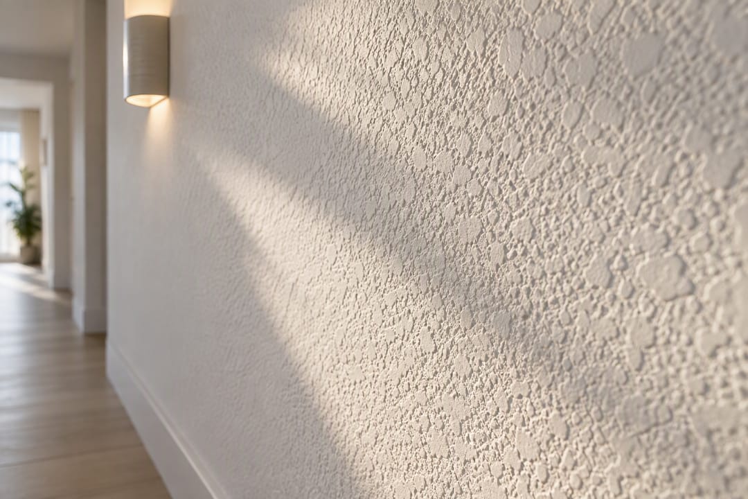
Averaged together across a photo, that texture can visually darken a wall even when the paint itself is a bright white. Add a slightly warm or cool light source, and those shadowed texture pockets pick up the color cast more visibly than a smooth surface would, because shadow areas show color shifts more obviously than brightly lit ones.
Glossy or semi-gloss finishes introduce a different problem entirely: specular highlights. A glossy wall reflects light sources directly, which can create bright hot spots next to darker, shadowed patches in the same frame, tricking the camera’s meter and making the overall wall look uneven rather than gray.
If you’re photographing a heavily textured wall, expect it to read slightly darker than a smooth one under identical lighting, and don’t assume a slightly dim texture wall means your white balance is wrong. Sometimes the texture itself is doing that. Editing can lift overall brightness, but it can’t and shouldn’t erase texture entirely, since flattening it out too far starts to look artificial rather than clean.
Does Natural or Artificial Light Change How White Walls Look?
Natural daylight and artificial light produce different color temperatures, and that difference is often the single biggest reason the same wall looks different in two photos. Daylight through a window shifts throughout the day, running cooler and bluer at midday and warmer near sunrise and sunset. A wall photographed at noon under open sky reads closer to true white than the same wall shot an hour before sunset.
Artificial light adds its own signature. Older incandescent and halogen bulbs run warm, often below 3000K, and pull walls toward yellow or orange unless corrected. Fluorescent tubes, common in older rental units and basements, tend to shift toward green, which is a cast most people don’t consciously notice in person but that a camera picks up clearly. Modern LED bulbs vary widely, since a “warm white” LED and a “daylight” LED sitting in the same fixture aisle can differ by 2000K or more.
The practical issue for listing photos is contrast between rooms. A living room shot in bright afternoon daylight and a hallway shot under a warm ceiling fixture can end up looking like they belong to two different properties once placed side by side in a gallery. Matching bulb color temperature across fixtures, or at minimum shooting each room under one dominant light source rather than a blend, keeps that contrast from creeping into your final set. For hosts weighing new bulbs specifically to solve this, comparisons of warm versus cool white lighting by room are worth a look before your next restock.
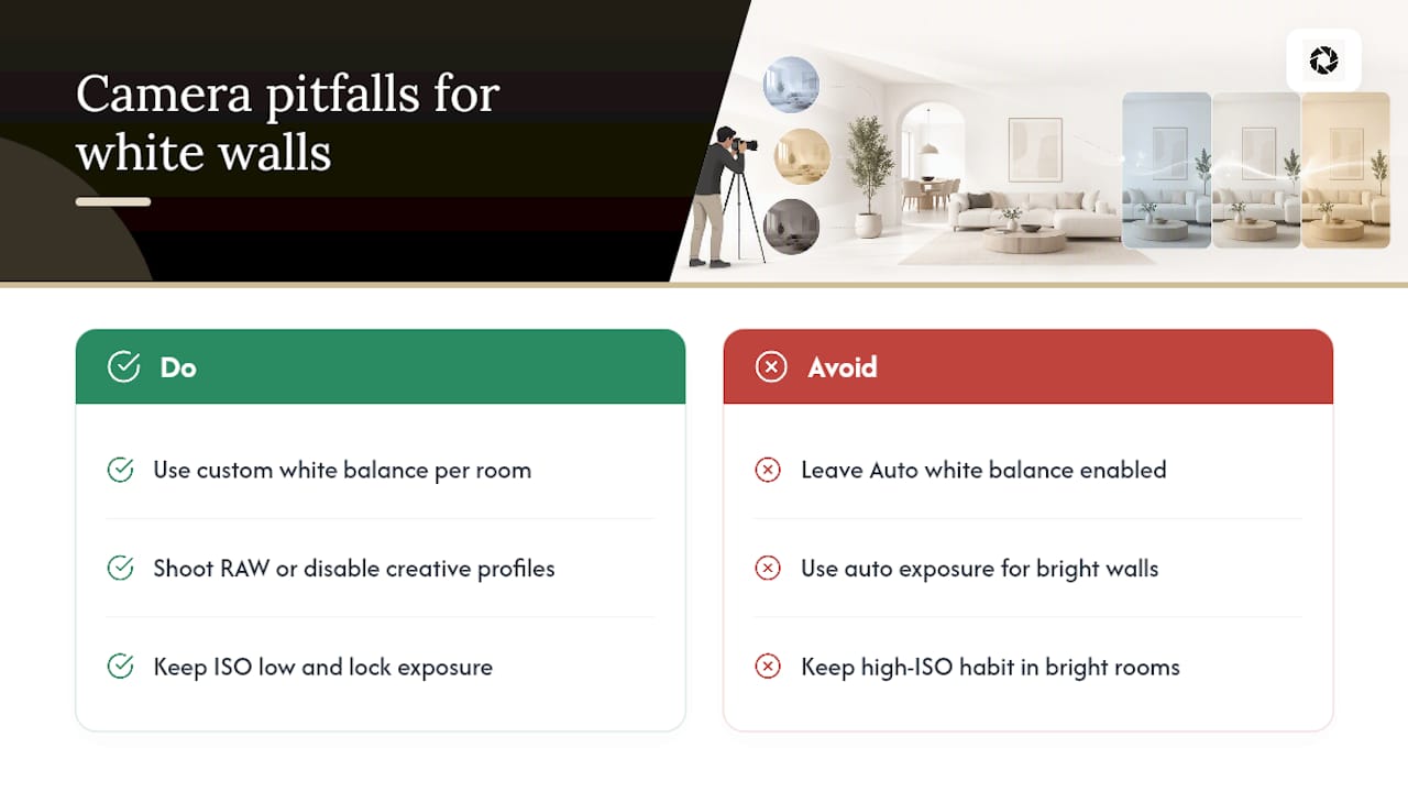
What Camera Settings Pitfalls Make Whites Look Gray?
Auto white balance is the most common pitfall, and it’s not really a flaw in the camera so much as a limitation. It works within a defined range of scenes and lighting conditions, and a room with mixed illuminants or a strongly dominant color, like a wall covered in artwork or a heavily wood-toned floor, can pull that automatic reading off target in either direction.
Auto exposure modes cause the second most common issue, for the reason already covered: meters bias toward mid-gray, and a scene with a lot of bright wall space gets read as brighter than it should be, so the camera compensates by underexposing. The wall that should be white ends up rendered gray because the camera thought the room was brighter than it actually was.
A less obvious pitfall is leaving high ISO settings active in bright rooms out of habit from shooting darker interiors elsewhere in the property. Unnecessary ISO adds noise that becomes visible once you lift exposure or shadows in editing, and that noise shows up worst on smooth, light surfaces like a plain white wall, where there’s no texture or detail to hide it.
Shooting in JPEG with in-camera “creative” or “vivid” picture profiles active is another quiet culprit. These profiles boost contrast and saturation before you ever open an editor, sometimes pushing whites toward a cooler or warmer tone depending on the profile’s built-in color science, and once baked into a JPEG that shift is far harder to remove cleanly than it would be starting from RAW.
Finally, forgetting to reset white balance between rooms with different lighting is an easy, avoidable mistake. A custom white-balance reading taken in a sunlit bedroom does not carry over correctly to a windowless bathroom lit by a single warm bulb down the hall.
What Else Can You Adjust Beyond White Balance in Editing?
Temp and Tint sliders fix the primary color cast, but they don’t fix everything working against a clean white wall. A few additional tools in most RAW editors handle the rest.
Vibrance and saturation deserve a light touch near white surfaces specifically. Pushing saturation globally can introduce a faint color tint into what should be a neutral wall, since saturation amplifies whatever small color variance already exists in that area, even variance too subtle to notice before the adjustment.
Clarity and texture sliders change how much local contrast shows on a textured wall, which affects perceived brightness more than people expect. Too much clarity on a heavily textured wall can make it look gritty or dirty rather than clean; too little can make it look flat and plasticly.
Selective color adjustments, sometimes called HSL or color mixer panels, let you target the gray or white luminance range specifically and nudge its hue without touching the rest of the image. This is useful when a wall carries a faint leftover cast after your main Temp and Tint correction, often from a colored object just out of frame bouncing light onto the wall.
Dehaze, used sparingly, can cut through a faint atmospheric or lens-flare haze that sometimes settles over a bright wall shot against strong window light, though it’s easy to overuse and flatten the image if pushed too far.
The goal across all of these is restraint. A wall corrected to a clean, believable white should still look like a photograph of a real room, not a graphic rendering.
Why Does Monitor Calibration Matter for Checking White Walls?
An uncalibrated monitor can make a perfectly corrected photo look wrong, or make a genuinely flawed photo look fine, and you’d never know which was happening without a calibrated reference. Every display has its own color temperature, brightness, and gamma curve out of the box, and consumer monitors and laptop screens are rarely accurate by default.
If your monitor runs warm, a wall you’ve corrected to true neutral white will look slightly blue or cold to you on screen, and you might overcorrect it warmer to compensate, introducing a color cast that wasn’t there before. If your monitor runs cool, the opposite happens: you’ll warm up a wall that was already neutral, and it will look off once viewed on a properly calibrated screen or a guest’s phone.
This is why reviewing your gallery on more than one device matters as much as any single editing step. A photo that looks clean on your main editing monitor and slightly off on a phone or tablet is a signal that either your monitor needs calibrating or you’ve made an edit that only looks correct on your specific setup. Hardware calibration tools solve this properly, but even without dedicated equipment, cross-checking on a couple of different screens catches the worst offenders before they go live on a booking platform.
The Real Metric Isn’t a Perfect White. It’s a Consistent One.
Most advice on this topic treats gray walls as a single technical problem with a single fix: correct white balance, done. That’s incomplete, and it’s why hosts who follow generic white-balance tips still end up with a listing gallery where every third photo looks like it came from a different property.
The judgment this research actually supports is that lighting groups, not individual photo tweaks, are the real unit of work. A wall corrected in isolation can look perfect on its own and still clash badly with the room next to it, and clashing colors across a gallery cost trust with guests faster than any single imperfect photo does.
Conventional advice also underweights when to stop editing. Not every underexposed or color-cast photo is worth saving, and pushing sliders past what a file can support produces noise and banding that look worse than the original problem. Prioritize gallery-wide consistency first, protect real detail second, and treat a full reshoot as the right call for the handful of photos that are genuinely unusable, rather than the default response to any color cast.
— The HospitalityLens Team
Try HospitalityLens on One Photo Before You Commit to Anything
If you’ve got a listing photo where the walls read gray and you’re not sure whether it’s worth fixing yourself or starting over, try one photo free and see the correction before spending anything.

Current HospitalityLens pricing (USD); one-time packs — The Hero: 1 photo for $12; The Refresh: 10 photos for $59; The Property: 25 photos for $129; The Portfolio: 100 photos for $399; monthly subscriptions — THE STARTER: 10 photos/month for $49/month; THE OPERATOR: 25 photos/month for $99/month; THE PORTFOLIO: 100 photos/month for $299/month; one-time pack credits do not expire; monthly subscription credits remain valid for up to 3 months; 2 free revisions per photo on one-time packs; 3 free revisions per photo on monthly subscriptions. See current pricing.
Sources
For camera fundamentals, see Nikon’s white balance guide and Canon’s exposure compensation guide. For editing workflow, see Adobe’s white balance explainer and HospitalityLens’s guide to brightening interior photos.
FAQ
Why do my white walls look gray in photos but fine in person?
Your eyes automatically adjust for color casts and dim light in a way a camera sensor doesn’t. The camera records the actual light hitting the wall, including a warm lamp cast or an underexposed meter reading, which is why walls that look white to you can read gray on screen.
Is a gray wall in a photo always a white balance problem?
No. It’s often exposure, since camera meters bias toward mid-tone gray and can underexpose a bright wall. Check your histogram first; a cluster on the left side points to exposure, not color, as the cause.
Should I reshoot or edit a photo with gray walls?
Edit if the original has enough recoverable detail and no severe noise or clipping. Reshoot only when the wall is blown out beyond recovery, the image is too noisy to lift, or key angles are missing entirely.
How much does HospitalityLens cost to fix one photo?
Free watermarked preview. Pay only if you like it. No card is required to create the free watermarked preview. See current pricing for unlocks, one-time packs, and subscriptions.
Can editing software fix gray walls without shooting RAW?
Yes, but with less flexibility. RAW files hold more color data for correction, so JPEG fixes need to be lighter and more careful to avoid banding or visible noise once you lift exposure and adjust color.
Recommended