Photography Tips
Image Types That Reliably Improve Click-Through Rates
Unlock higher engagement and conversions by strategically choosing captivating visuals that resonate with your audience across various digital platforms.
By Hospitality Lens · · 23 min read

The image types that most consistently lift click-through rates are: hero/lead product shots, lifestyle and product-in-use images, user-generated content with real faces, close-up detail shots, context/scale images, infographics and comparison visuals, icons and screenshots (especially for SaaS), GIFs and short video thumbnails, and attention-focused thumbnails with bold contrast or curiosity gaps. These categories hold across channels, though the right choice shifts depending on whether you’re running email campaigns, paid social, search display, or managing product and listing pages.
A quick channel map before you go deeper:
- Email: hero banner + lifestyle inside the body
- Paid social/display: faces, before/after splits, bold-text thumbnails
- Search/Google Discover: large original images (1,— preferred), no text overlays
- Product and listing pages: close-ups, context/scale, lifestyle mockups
The stakes are real. In controlled SERP experiments, rich media results captured dramatically more clicks than identical text-only listings — one scenario showed an author image alone capturing 46% of clicks versus 10% for the top unenhanced result. That gap is not a rounding error. It’s the difference between a campaign that pays for itself and one that quietly drains budget.
Key Takeaways
The image types that most reliably improve click-through rates are lifestyle, UGC with real faces, close-up details, and attention-focused thumbnails, each matched to the channel where they perform best and validated through disciplined A/B testing.
| Point |
Details |
| Lead with lifestyle and faces |
Lifestyle images and real faces consistently outperform product-on-white in ads and social feeds. |
| Match image type to channel |
Hero and lifestyle for email; UGC and before/after for paid social; large originals for Discover. |
| Technical specs protect CTR |
Use WebP at 1,— for web, keep email banners under 200KB, and always include alt text. |
| Test one variable at a time |
Change only the image per test, run for at least two weeks, and target 1,000+ impressions per variant. |
| HospitalityLens for listing upgrades |
AI enhancement corrects lighting, color, and clutter on existing photos without inventing features. |
Table of Contents
1. Hero and Lead Product Shots
A hero image is the first visual a visitor sees, and it carries the entire first impression. On a product page, it’s the image that either earns the click to the next photo or loses the visitor to a competitor. On an email, it sets the emotional tone before a single word is read.
What makes a hero image work is clarity and confidence. One subject, clean background, professional lighting, and a composition that fills the frame without crowding it. The photo is the first decision point for the viewer, and ambiguity at that stage costs you the click.
For property listings, the hero shot is almost always the primary bedroom or the most distinctive room in the property. A dark, crooked, or cluttered hero image signals neglect before the guest reads the price. Correcting the lighting, straightening the horizon, and removing distracting objects can reset that first impression without a new shoot, provided the original photo has usable bones.
Pro Tip: Test two hero variants: one with the full room in frame and one tightly cropped to the most appealing detail (a styled bed, a fireplace, a view). Tight crops often outperform wide shots at thumbnail scale because they read faster.
2. Lifestyle and Product-in-Use Images
Lifestyle images show the product or space in active use. A coffee maker on a white background tells you what it looks like. A coffee maker on a marble counter with morning light and a half-read newspaper tells you how it feels to own it. That emotional layer is what drives the click.
The psychological mechanism here is aspiration combined with self-projection. When a viewer can picture themselves in the scene, the image becomes personal rather than transactional. For ecommerce, this is why lifestyle shots consistently outperform pure product-on-white in ad creative, particularly on social platforms where the feed is already full of aspirational content.
For hospitality, lifestyle images show guests living in the space: reading on the balcony, cooking in the kitchen, relaxing by the pool. These images answer the question the guest is really asking, which is not “what does this room look like?” but “will I enjoy being here?” A well-lit, honest lifestyle photo of a guest using the space is more persuasive than any headline you can write.

When the original photo is a dark, wide-angle shot of an empty room, AI enhancement can improve the lighting and color balance to make the space feel warmer and more inviting. What it cannot do is add people, invent a view, or suggest amenities that don’t exist. The improvement is real; the scene stays truthful.
3. User-Generated Content and Review Photos with Real Faces
UGC images, meaning photos taken by real customers or guests and shared publicly, carry a trust signal that no professional shoot can replicate. They look imperfect by design, and that imperfection is the point. A slightly grainy photo of a real guest smiling in your rental reads as honest in a way that a polished stock image cannot.
Thumbnail studies confirm that expressive human faces correlate with materially higher CTR in thumbnail-driven feeds. The face creates an immediate emotional connection and signals that real people have been there. For paid social ads, a UGC-style image with a genuine expression often outperforms a studio shot because it doesn’t look like an ad.
The practical challenge is sourcing and rights. Always get explicit permission before using a guest’s photo in paid advertising. For organic social and email, the bar is lower, but written permission is still the safest approach. A short message to the guest asking to share their photo, with credit, takes two minutes and protects you from copyright issues.
4. Close-Up and Detail Shots
Close-up images isolate a single feature and make it undeniable. A stitching detail on a jacket, the grain of a hardwood floor, the texture of a linen duvet. These images answer the skeptic’s question: is this actually as good as it looks in the wide shot?
Research on ecommerce product images consistently links high-resolution, clear product images to improved click-through rates. The resolution matters because close-ups fall apart when they’re compressed or blurry. A pixelated detail shot is worse than no detail shot at all, because it raises doubts instead of resolving them.
For property listings, detail shots of premium finishes, quality appliances, or thoughtful amenities (a well-stocked coffee station, a rainfall showerhead, a view from the window) build the case for the price point. They’re also the images most likely to be shared by guests, which extends your reach without additional spend.

Pro Tip: Shoot detail images at the highest resolution your camera allows, then compress for web. Never upscale a low-resolution original — the artifacts are immediately visible at close-up scale.
5. Context and Scale Images
A product or space without a reference point is hard to evaluate. Context images solve this by placing the subject next to something familiar: a hand holding a product, a person standing in a room, furniture arranged around a recognizable object. The viewer’s brain instantly calibrates size, proportion, and usability.
For property listings, scale images are particularly persuasive. A bedroom that looks spacious in a wide-angle shot may feel cramped when a guest arrives. Showing the room with a made bed, bedside tables, and a person standing near the window gives an honest sense of the actual dimensions. Guests who feel accurately represented in the listing are less likely to leave negative reviews, which protects your long-term CTR on booking platforms.
Context images also work well in email campaigns where you’re promoting a specific property or room type. A photo of the living room with a family relaxing in it communicates “this is a family-friendly space” faster than any bullet point in the copy.
6. Infographics and Comparison Visuals
Infographics earn clicks by promising a shortcut. They signal to the viewer: “you can understand this complex thing quickly if you click.” For comparison ads, a side-by-side visual showing before/after, plan A versus plan B, or feature X versus feature Y creates a curiosity gap that pulls the click.
Industry guides identify the before/after split as one of the most consistently high-performing thumbnail formulas. The format works because it implies a transformation and makes the viewer want to know what caused it. For property listings, a before/after showing a photo enhancement (dark, crooked original versus bright, corrected final) is a direct demonstration of value.
For email and paid social, infographics with a clear headline number (a percentage, a price, a count) outperform text-heavy graphics because they’re readable at a glance. Keep the text minimal, the contrast high, and the focal point obvious. An infographic that requires zooming in to read is an infographic that doesn’t get clicked.
7. Icons and Screenshots for SaaS and App Contexts
For software products, dashboards, and app interfaces, icons and screenshots are the most honest image type available. They show the actual product, not a lifestyle interpretation of it. A clean screenshot of a well-designed interface communicates competence and clarity in a way that a stock photo of someone typing on a laptop never can.
The key is curation. A raw screenshot of a complex dashboard is overwhelming. A cropped, annotated screenshot that highlights one specific feature or workflow is persuasive. The annotation draws the eye to the value, and the real interface builds trust.
For SaaS email campaigns, a product screenshot in the hero position consistently outperforms abstract imagery because it answers the viewer’s first question: “what does this actually look like?” That directness reduces friction and increases the likelihood of a click.
8. GIFs and Short Video Thumbnails
Motion captures attention in a static feed. A well-executed GIF showing a product feature, a room transformation, or a before/after sequence stops the scroll in a way that a still image cannot. The movement doesn’t need to be dramatic; even a subtle loop of a fireplace flickering or a pool reflecting light creates a sense of life that static images lack.
For short video thumbnails on platforms like YouTube or social feeds, the thumbnail is the image that determines whether the video gets watched. High-performing thumbnail formulas consistently include an expressive face, a bold readable number or claim, and a curiosity gap that the video promises to resolve. A reaction face paired with a bold number outperforms either element alone.
GIFs carry a file-size risk. An unoptimized GIF can be several megabytes, which kills load time and email deliverability. Keep GIFs under 1MB for email, use the first frame as a fallback for clients that don’t render animation, and test rendering across major email clients before sending.
9. Attention-Focused Thumbnails with Contrast and Curiosity Gaps
A thumbnail is not a miniature version of your full image. It’s a separate creative problem. At 120 by 90 pixels, most of the detail in a full-resolution photo disappears. What survives is contrast, color, and a single clear subject.
Platform guidance for feed-style displays recommends large original images (1,— preferred) and avoiding text overlays, because unpredictable cropping reduces their effectiveness. For Google Discover-style surfaces, posts with large, original images can see substantially higher CTR than those with small or generic visuals.
The curiosity gap is the most reliable psychological lever at thumbnail scale. An image that implies a question (“what happened here?”, “how did this room change?”) creates an itch the viewer wants to scratch. For property listings, a thumbnail showing a beautifully lit room with an unusual architectural detail or a striking view creates that gap without any text overlay needed.
Design rules that hold across platform guides include: one clear subject, high contrast between subject and background, expressive faces or strong poses where appropriate, and consistent brand color treatment. These aren’t aesthetic preferences; they’re functional requirements for images that need to communicate in under a second.
Matching the right image type to the right channel is where most teams leave CTR on the table. A lifestyle image that performs well in a paid social feed may be completely wrong for a Google search result. Understanding the constraints of each channel prevents wasted creative effort.
Email
Campaign Monitor’s guidance is clear: targeted, relevant imagery inside emails materially affects CTR when images match the message and are optimized for mobile. The hero banner sets the tone; the image inside the body drives the click. Use lifestyle or hero images in the banner, and close-up or context images near the CTA.
Avoid image-only emails. Many email clients block images by default, so an email that’s entirely visual renders as a blank rectangle for a significant portion of your list. Always include descriptive alt text, and make sure the email reads coherently even if no images load.
Paid social and display
Faces, before/after splits, and bold-text thumbnails perform best here. The feed is competitive and the viewer is not looking for your ad. An image that looks like organic content (UGC-style, natural lighting, real faces) tends to outperform polished studio imagery because it doesn’t trigger the “this is an ad” skip reflex.
Avoid cluttered backgrounds and small text. At mobile display sizes, anything smaller than a headline-sized font is unreadable. High contrast between subject and background is non-negotiable.
Search and Google Discover
Large, original images with no text overlays. Generic stock imagery performs poorly on Discover-style surfaces because the algorithm and the viewer both recognize it. Custom photography or AI-enhanced property photos that show a real, specific place outperform generic visuals consistently.
Product and listing pages
Close-ups, context/scale images, and lifestyle mockups work hardest here. The visitor is already interested; the images need to resolve doubts and confirm the decision. A sequence that moves from hero to detail to lifestyle to scale gives the viewer everything they need to click “book” or “add to cart.”
| Channel |
Best image types |
Key constraint |
Avoid |
| Email |
Hero banner, lifestyle, close-up |
Mobile rendering, alt text required |
Image-only layouts |
| Paid social |
UGC-style, faces, before/after |
High contrast, readable text |
Cluttered backgrounds |
| Google Discover |
Large original, no text overlay |
1,— minimum width |
Stock imagery, text overlays |
| Product/listing pages |
Close-up, context/scale, lifestyle |
High resolution, accurate representation |
Misleading wide-angle distortion |
Accessibility and localization: Write descriptive alt text for every image, not just “photo of room” but “sunlit bedroom with king bed and floor-to-ceiling windows facing east.” For international campaigns, review imagery for cultural appropriateness. Hand gestures, color associations, and lifestyle cues carry different meanings across markets. Testing image variants by demographic segment in paid social is the fastest way to identify which visuals resonate with a specific audience.
Technical specs that protect your CTR
Format, resolution, and file size are not afterthoughts. A beautiful image that loads slowly or renders incorrectly in an email client loses its CTR advantage before the viewer even sees it.
Format guidance: Use WebP as your primary format for web placements. WebP delivers smaller file sizes at equivalent quality compared to JPEG, which means faster load times and better Core Web Vitals scores. Where WebP isn’t supported (some older email clients, certain ad platforms), fall back to JPEG for photographs and PNG for images requiring transparency. Google Discover guidance specifically recommends WebP for performance on feed-style surfaces.
Resolution and aspect ratios: Hero images for listing pages should be at least 1,— wide. Thumbnails for social ads typically render at 1,200 by 628px (16:9) or 1,080 by 1,080px (square). For Google Discover, 1,— is the recommended minimum width. Use srcset attributes in HTML to serve appropriately sized images to different screen sizes rather than forcing every device to download a desktop-sized file.
Email-specific constraints: Most email clients impose a total HTML size limit, and hosted images (linked via URL) are more reliable than CID-embedded images across clients. Keep email banner images under 200KB. Gmail clips emails over 102KB of HTML, which can hide your CTA entirely. Test rendering in Litmus or Email on Acid before sending to a large list.
Pro Tip: Save every image asset in two versions: a WebP master and a JPEG fallback. Name them consistently (hero-bedroom-v1.webp / hero-bedroom-v1.jpg) so your pipeline can serve the right format automatically without manual intervention.
High-resolution, clear product images are directly associated with improved ecommerce CTR in academic research. Compression that visibly degrades quality is a false economy: the file size saving is small, and the CTR cost is real.
How to run image A/B tests that give you reliable results
Testing images without a methodology is just guessing with extra steps. A valid image A/B test starts with a specific hypothesis, runs long enough to reach statistical significance, and changes only one variable at a time.
Step 1: Write a hypothesis. “Replacing the hero stock photo with a lifestyle image of the property in use will increase CTR by at least 10% over the current baseline.” The hypothesis names the change, the metric, and the expected direction. Without it, you can’t evaluate whether the test succeeded.
Step 2: Define your metrics. Primary metric is CTR. Secondary metrics are conversion rate, cost per click (for paid), and bounce rate. A CTR lift that comes with a bounce rate increase may indicate the image is attracting the wrong audience.
Step 3: Determine sample size before you start. A common practitioner rule is to run the test until each variant has received at least 1,000 impressions and the test has run for a minimum of two weeks. Two weeks accounts for day-of-week variation in user behavior. For email, a 20% split test (10% to each variant, 80% to the winner) is a standard approach for lists above 10,000 subscribers.
Step 4: Isolate the image variable. Change only the image. Keep the headline, copy, CTA, and targeting identical. If you change two things at once, you can’t attribute the result to either.
Step 5: What to test. Work through this checklist in order:
- Image type (lifestyle vs. hero vs. UGC)
- Subject (person vs. product vs. space)
- Background contrast (clean vs. contextual)
- Face vs. no face
- Text overlay vs. none
- Before/after split vs. single image
Step 6: Read results and act. Scale the winner immediately. Archive the loser with notes on why it underperformed. Run a follow-up micro-test on the next variable in the checklist. Creative testing is a cycle, not a one-time event.
For multivariate tests (testing multiple image elements simultaneously), you need substantially larger sample sizes. Most teams are better served by sequential A/B tests than by multivariate designs, because the sample size requirements for multivariate testing are prohibitive for all but the largest campaigns.
What the research actually shows about images and CTR
The evidence for images improving CTR is consistent across contexts, though the magnitude varies considerably by channel, image quality, and how “improvement” is measured.
The most striking data point comes from controlled SERP experiments: in one scenario, a result with an author image captured 46% of clicks while the top-ranked text-only result captured just 10%. In another scenario, star-review snippets at position two captured most clicks compared to a much smaller share for an unenhanced position-one result. These are extreme cases, but they illustrate the ceiling of what visual differentiation can do.
For property listings specifically, the trust mechanism is central. A guest booking a short-term rental is making a financial commitment based almost entirely on photos. Images that are clear, honest, and well-lit reduce perceived risk. Images that look dark, crooked, or staged in the wrong direction raise it. The click is the first test of that trust.
Practitioner reports on AI-generated and AI-enhanced visuals indicate that switching from generic stock to custom or AI-assisted imagery can produce substantial CTR uplifts at the site level, though results vary significantly by use case and baseline quality. The consistent finding is that specificity beats generality: a real photo of a real place, well-lit and honestly presented, outperforms a generic stock image of a similar space.
Where the evidence is thinner: long-term CTR effects of image changes (most studies measure short windows), the interaction between image type and audience demographics, and the precise contribution of image quality versus image type. These are gaps worth acknowledging. The practical implication is to test your own audience rather than assuming published averages apply directly to your campaigns.
For property managers considering AI photo enhancement, the appropriate use case is improving existing photos that have usable composition but poor lighting, color, or minor clutter. When the original photo is unusable (wrong angle, too dark to recover, missing key features), a professional photographer remains the right answer.
Your 30/60/90-day plan to improve CTR with images
This plan is designed for teams that have existing listing or ad images and want to improve CTR without a full creative overhaul. It prioritizes quick wins first, then systematic testing, then scale.
Days 0–30: Quick wins
- Audit your current hero images across all active listings and ads. Flag any that are dark, crooked, cluttered, or using generic stock.
- Replace generic stock images with real, specific photos of the actual property or product.
- Add descriptive alt text to every image on your listing pages and email templates.
- Compress all images to the recommended file sizes in the technical specs table above.
- Set up one A/B test on your highest-traffic listing or ad: lifestyle image versus current hero.
Days 30–60: Systematic testing and asset production
- Run the image variable checklist from the A/B testing section, one test per two-week cycle.
- Produce close-up and context/scale images for your top five listings or products.
- Build a before/after thumbnail for your best-performing listing and test it in paid social.
- Review email campaign images for mobile rendering and alt text completeness.
- Identify three listings or ads where UGC-style images could replace polished studio shots.
Days 60–90: Scale winners and refresh cycles
- Scale the winning image types from your tests across the full portfolio.
- Establish a quarterly image refresh cycle for underperforming listings.
- Build a naming convention and folder structure for image assets (channel/type/variant/date).
- Set up responsive image delivery (srcset) for your listing pages if not already in place.
For teams managing multiple listings, a structured image optimization process that includes naming conventions, responsive asset sets, and versioning prevents the creative chaos that builds up when images are uploaded ad hoc across platforms.
What we actually think about image testing and truthful enhancement
The most common mistake we see is treating image improvement as a one-time task rather than a measurement discipline. A team replaces a dark hero photo with a brighter one, sees a modest CTR lift, and moves on. Six months later, the listing is underperforming again because the image that was “good enough” in January looks dated against competitors who kept testing.
The second mistake is conflating enhancement with deception. Correcting the lighting on a real photo is not the same as adding a view that doesn’t exist or staging furniture that won’t be there when the guest arrives. Truthful improvement builds trust. Misleading staging destroys it, usually in the form of a one-star review that follows the listing for years.
Professional photography remains the right choice for flagship property launches, architectural work, or situations where the original photos are simply unusable. No enhancement tool, AI or otherwise, can recover a photo taken from the wrong angle or in conditions that made the space look fundamentally different from reality. When the bones are there, enhancement is a practical and honest option. When they’re not, a photographer is the answer.
Measurement is what separates a guess from a decision. Every image change you make should have a hypothesis, a test, and a result you can act on. The teams that improve CTR consistently are the ones that treat creative as a variable to optimize, not a fixed cost to minimize.
Faster listing image upgrades without a new photoshoot
If you manage short-term rentals, vacation properties, or boutique hotel rooms and your current listing photos are holding back your CTR, HospitalityLens offers a practical path forward. The service takes dark, crooked, cluttered, or owner-submitted photos and returns professionally enhanced images: corrected lighting and color, straightened horizons, cleaned-up clutter, and removed objects, all while preserving the real property.
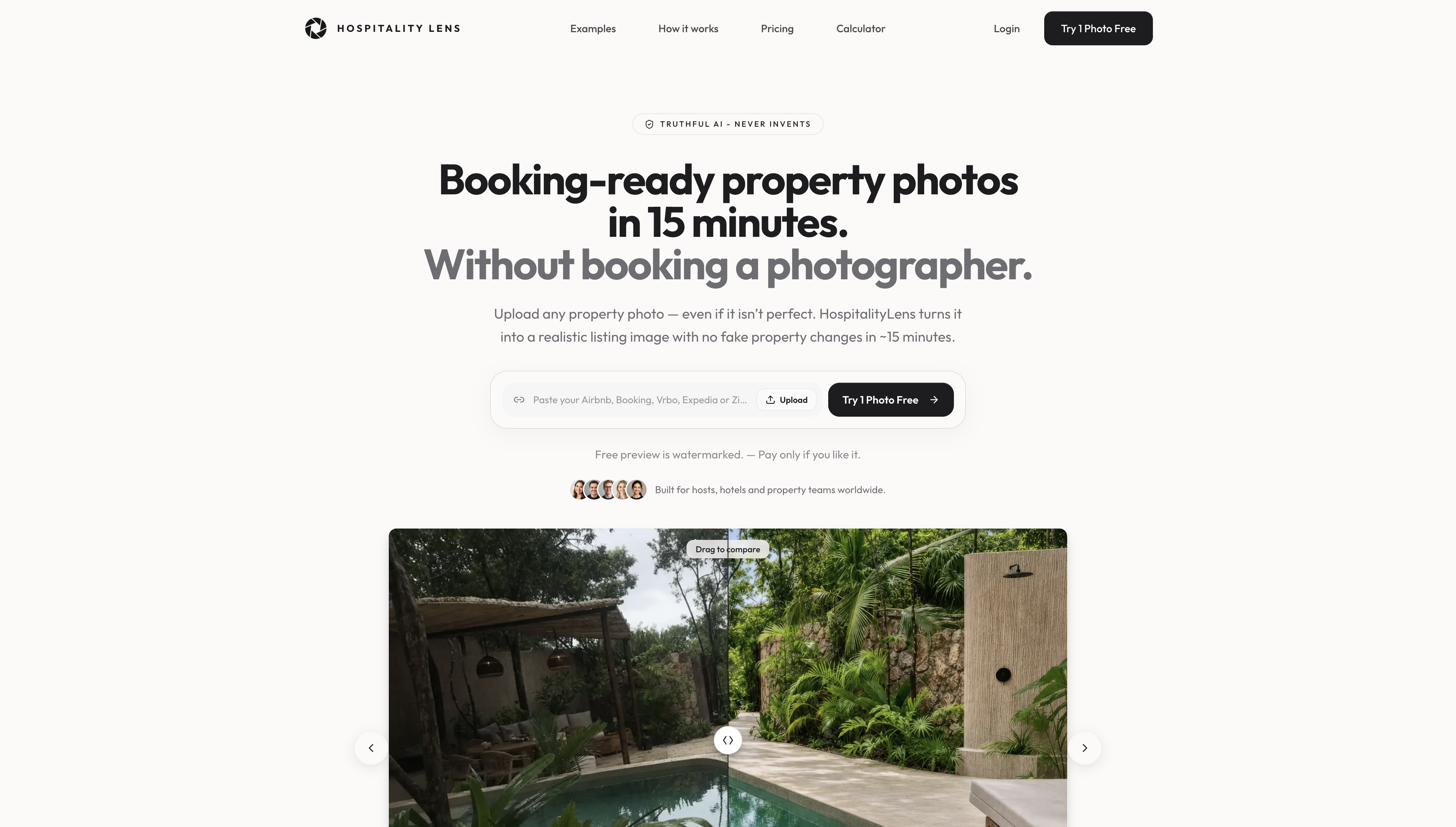
It’s built for property managers and hospitality teams that need faster onboarding, seasonal photo refreshes, or portfolio-wide consistency without scheduling a photographer for every listing. One-time packs start at $59 for 10 photos ($5.90 per photo), and monthly subscriptions start at $49 for 10 photos per month. Every photo includes revisions, and the initial free preview is watermarked so you can evaluate the result before paying.
For flagship launches or architectural photography where new angles are needed, a professional photographer is still the better option. For the listings where the composition is solid but the execution is rough, try one photo free and see the result before committing.
Sources
FAQ
What types of images increase click-through rates most reliably?
Lifestyle images with real people, close-up detail shots, and UGC-style photos with expressive faces consistently outperform generic stock imagery across email, paid social, and listing pages. Thumbnails with high contrast, a clear subject, and a curiosity gap perform best in feed-style placements.
How do you increase click-through rate on a listing or ad?
Replace generic or low-quality images with specific, well-lit photos of the actual product or space, match the image type to the channel (lifestyle for social, close-ups for listing pages), and run A/B tests with one image variable changed at a time to identify what moves CTR for your specific audience.
Is JPEG or PNG better for email images?
JPEG is the better choice for photographs in email because it produces smaller file sizes at acceptable quality. PNG is appropriate only when the image requires transparency. Keep email banner images under 200KB and use hosted URLs rather than embedded images for reliable rendering across email clients.
What is the 80/20 rule for email marketing?
The 80/20 principle in email marketing suggests that roughly 80% of your results come from 20% of your campaigns or elements, which in practice means prioritizing your hero image and subject line above all other variables since they determine whether the email gets opened and clicked at all.
How large should images be for Google Discover?
Google Discover guidance recommends a minimum width of 1,— for images on feed-style surfaces, with WebP as the preferred format for performance. Avoid text overlays, as unpredictable cropping on different devices reduces their effectiveness.
Recommended